GROUND TRAFFIC CONTROL - LIVE MAPS
GTCx Maps enables fleet operators to monitor the real-time location and status of their assets, whether at a desktop or out in the field. This project modernized a legacy experience into a sleek, mobile-friendly platform that aligns with current industry expectations, without losing the familiarity users depended on.
Principal Product Designer — Lead Designer & Researcher
ZONAR SYSTEMS, GROUND TRAFFIC CONTROL

The Problem
The legacy Ground Traffic Control platform was fragmented and outdated, with each task siloed into a separate page. Users needed a unified, modern solution to streamline workflows, reduce friction, and increase usability, especially for field operations.
At the same time, about 30% of the user base was resistant to change, which meant innovation had to be balanced with deep research to ensure clarity, continuity, and confidence.
Goals & Constraints
The primary goal was to modernize the GTC Maps experience without losing the trust of our existing user base. The platform had grown outdated visually, functionally, and structurally. Users expected a tool that could keep pace with modern fleet demands, especially as competitors introduced cleaner, more mobile-friendly solutions.
Key Goals:
Unify disconnected tools: Previously, users had to jump between multiple pages to complete simple tasks. One objective was to consolidate these workflows into a single, streamlined experience that minimized context switching and cognitive load.
Design for the field: A significant portion of users rely on GTC Maps while on the go. I needed a responsive, touch-friendly interface that worked just as well on mobile as it did on desktop, without sacrificing clarity or performance.
Balance familiarity with innovation: With roughly 30% of the user base hesitant to adopt a new system, it was critical to evolve without alienating. Terminology, layout, and key interaction patterns had to feel intuitive, even when reimagined.
Back every decision with research: Design choices weren’t made in isolation. From competitive audits to prototype testing, every decision was grounded in evidence, helping ensure stakeholder alignment and user confidence.
Meet or exceed a SUS score of 80: Usability was a formal success metric. The bar was set high: a System Usability Scale score of 80+ would indicate I successfully delivered both a modern experience, and a usable one.
Constraints:
Legacy expectations: The previous interface had been around for years, meaning users had developed deep habits. Disrupting those patterns posed risks to adoption and productivity.
Platform overhaul timing: GTC Maps was the first application to launch as part of a broader platform redesign. That meant the work had to not only stand on its own, but set the tone for every product that followed.
Technical debt & scalability: Engineering was working to modernize backend systems alongside the UI. This required frequent cross-functional check-ins to ensure designs were feasible within sprint cycles and could scale to support future enhancements.
Research & Discovery
Before making a single design decision, I grounded myself in understanding user behavior, unmet needs, and the competitive landscape. This phase was critical not only for validating assumptions, but for building stakeholder confidence in a bold redesign.
Feature Inventory & Usage Analysis
The first step was to take inventory of the current Maps experience. Over time, the interface had grown bloated with legacy tools and features, many of which had unclear value or had fallen out of use.
I gathered analytical data from Pendo to reveal feature-level usage data, showing what users actually engaged with.
I created simple surveys that helped me verify that users weren't avoiding features due to poor existing usability.
This helped prioritize essential workflows and deprecate underutilized features, streamlining both design and development scopes.
Understanding User Behavior & Needs
Armed with quantitative data, I turned to qualitative insights to understand the “why” behind user actions.
I conducted remote user interviews across various personas, including dispatchers, fleet managers, and drivers, to uncover their pain points and needs.
I used a structured interview guide that included open-ended questions and interactive prototype feedback, ensuring sessions stayed focused but open to discovery.
Patterns emerged quickly as users wanted speed, clarity, and multi-purpose utility from a single screen without having to bounce between tools.

User feedback, via Dovetail, pointed to frequent frustration with redundant navigation and slow page load times.
Competitive & Industry Benchmarking
To ensure the redesign wasn’t just a better version of the old, but competitive in the market, I ran a comparative analysis of similar fleet management platforms.
I evaluated UI structure, key features, and mobile responsiveness of top players
I identified common standards (e.g., map-focused dashboards, real-time vehicle updates, route overlays)
I noted opportunities to differentiate, such as deeper vehicle status integration and intuitive filter controls

Mapping our feature set against competitors helped validate must-haves and identify areas of advantage.
Translating Insights into Direction
These research efforts laid the foundation for the product strategy:
We trimmed the fat, focusing only on features that delivered real value
Restructured navigation to align with mental models uncovered in interviews
Anchored the design in a mobile-first mindset to meet field use demands
Created a design brief summarizing findings and aligning stakeholders around the problem definition
Design & Prototyping
With a clear research foundation, I transitioned into design exploration by rapidly prototyping ideas to test assumptions, validate flows, and surface friction early. This stage wasn’t about getting it right the first time, but about making learning visible through design.
Low-Fidelity Exploration
I started by sketching and mocking up low-fidelity wireframes to explore layout ideas and task flows. These helped shape early decisions around:
Map-first layout prioritization: placing geospatial context at the core of the interface
Unified control panels: replacing multiple disjointed tools with a centralized hub
Progressive disclosure: so users weren’t overwhelmed by complexity upfront

Early wireframes emphasized map visibility while surfacing core interactions in a single view
Rapid Prototyping for Feedback
To quickly validate ideas, I built interactive prototypes in Figma that simulated real user flows, including:
Filtering vehicles by status or location
Drilling into an individual asset for live details
Navigating seamlessly between map and list views
I then scheduled and conducted remote user feedback sessions using these prototypes:
Built a self-serve scheduling flow to minimize friction for participants
Observed how users interacted with the designs while narrating their thought process
Captured usability issues, hesitations, and mental mismatches for refinement

Mid-fidelity prototypes allowed users to interact with the new map-first navigation approach.
Iteration & Design Decisions
Based on insights from the feedback sessions, I refined several key aspects of the UI:
Naming & taxonomy: I updated legacy terms to be more intuitive, but only after validating that the new language still resonated with veteran users
Iconography & controls: I simplified cluttered toolbars into streamlined sets of icons and grouped functions logically
Mobile-first adjustments: I made sure core workflows like vehicle search and map filtering were fully functional and ergonomic on small screens
Each iteration cycle helped balance innovation with familiarity. Even small adjustments, like changing the default zoom level or adjusting label placement, had noticeable impacts on user comprehension.
This stage wasn’t just about creating beautiful interfaces, it was about de-risking design decisions through fast, intentional iteration, and empowering both users and engineers to see where we were headed before a single line of production code was written.

Iterative testing led to key refinements in both UI structure and interaction details.
Execution & Collaboration
Once the designs were validated and refined through user feedback, I moved into full-scale execution. This phase was all about translating design intent into production reality, working closely with engineering, product management, and QA to ensure the experience held up under the demands of real-world use.
Partnering with Engineering from Day One
Rather than a waterfall-style handoff, I involved engineers early and often:
I led design walkthroughs during grooming sessions to align on interaction patterns and component behaviors
I participated in feasibility reviews to make sure designs aligned with backend capabilities and technical constraints
I created responsive design specs and usage guidelines directly in Figma, reducing ambiguity and rework
By building strong relationships with engineers, we avoided the “last-minute surprises” that often derail timelines in complex applications like fleet management.


Designs were always displayed for the engineers with the mobile version & desktop version side-by-side. Annotations in Figma clarified interaction expectations
Story Mapping & Sprint Planning
As part of the cross-functional team, I facilitated story mapping exercises to break the overall project into manageable milestones. This made it easier to:
Prioritize MVP functionality while keeping long-term scalability in mind
Identify dependencies between front-end components and data availability
Map designs to Jira tickets for clearer development scoping
These planning activities ensured that design wasn't just a phase, it was integrated throughout development.

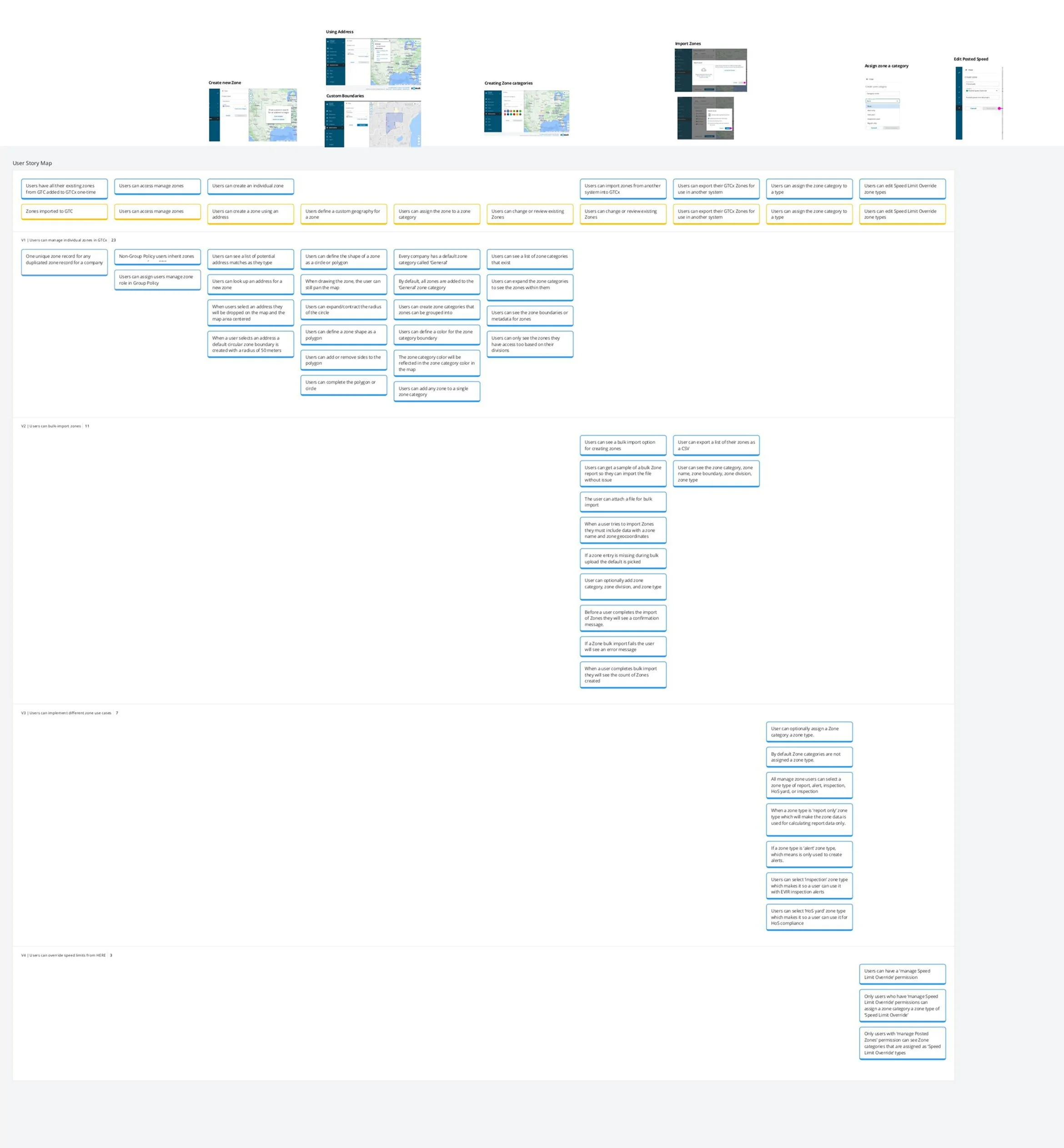
Story mapping helped break a large system redesign into clear, deliverable pieces.
Product Reviews & Design QA
As development progressed, I stayed actively involved in QA and product acceptance:
I reviewed work in progress during dev sprints, providing async feedback
I logged detailed feedback and edge cases in Jira, ensuring visual polish and interaction fidelity were upheld
This hands-on involvement reduced design debt and ensured the final release delivered exactly what users expected.
Supporting Rollout & Change Management
Because the Maps experience represented a major platform shift, I also collaborated on the internal rollout strategy:
I created visual artifacts and product documentation for sales and support teams
I created in-app tooltips, onboarding guides, and product marketing content to ensure consistency
This phase underscored one of my core beliefs as a designer: great products are not just designed well, they’re built well through continuous collaboration, clear communication, and shared ownership across disciplines.
Outcome & Impact
GTC Maps became the flagship application of the new platform, internally and externally celebrated as a symbol of modernization.
Accounted for 80% of platform usage
Set the standard for all future product design within the company
Reinforced confidence in the platform’s evolution for hesitant users